Photo retouching in the days before Photoshop was really very much an art, and while there were things like “electric retouching machines,” the work was closer to being a painter than some sort of technician. I suppose in many ways this is still true, but our equipment is vastly better. Knowing the skills required and difficulty of the task just makes what I’m about to show you all the more fascinating: The British Motor Corporation (BMC) would use re-touched photos extensively in brochures, even for entirely new models of cars.
I was turned on to these by Irish fan of British motoring history, Andrew, who runs The Car Factoids twitter feed and who provided me with these fascinating examples of cars that may be the best examples of this. Those cars include the BMC ADO16, known as the BMC 1100 and 1300, and the more upmarket BMC 1800 “Landcrab.”
Almost every carmaker retouched brochure photos to some degree or another, that’s not what’s interesting here. What’s unusual is the degree to which BMC did it, re-working photos of one model of car into an updated model, something that seems to be very unusual for a major automaker.
[Editor’s Note: I reached out to seasoned automotive photographer Mike Nykoruk (he’s shot a lot of images for the Big Three starting in the 1980s), who told me that what you see here was actually fairly common. “I shot a 1991/92 Chrysler Minivan, and they reused it every year until they changed the body style,” he told me. “They would just shoot the grille, strip it into the picture…They would pay me every year for usage of the photo.”
The “reuse fee,” he told me was less than what it would cost an automaker to commission out a new set of photographs. “It can rack up really quickly to try to duplicate a picture that they love,” he told me.
“Sometimes they don’t even pay the photographer again,” he said, though “In Detroit, with the big three, it was pretty much established that you couldn’t just do that.”
How did this work, even? Well, when things went digital in the 1990s, it meant taking lots of photos of wheels, grilles, headlights, taillights or whatever the automaker wanted changed (Nykoruk said he used a “lazy susan” — basically a turntable), and then grafting those photos — taken at precisely the right angle — into the original picture.
“When I shot the Buick LeSabre…they would reuse the photo, and they would bring the same car and just have me shoot the grille. And it was a grille-strip instead of the whole car,” he said.
But back in the day, things were more complex.
“In order for them to retouch, they would have to make a very high quality die sub-print, which itself would cost seven or eight hundred bucks, then an artist would paint the new thing on the actual print, and then they’d rephotograph it to make the actual picture. So it was a very complex process, but it was still cheaper to pay hte photographer, pay the artist, make the prints, re-do it then it was to go out and shoot a new picture,” Nykoruk told me.
He later went into more detail, saying:
Typically they would make a die print. It’s three layers of black and white film. They’d expose it. They’d shoot one of them through a red filter, one through a blue filter, one through a green filter, then soak them in cyan, magenta, and yellow dies. And then they’d lay them down on a piece of paper in registration, and then the yellow would go down, the cyan would go down, the magenta would go down; you’d peel that up, and it was like perfect color — if it was good. That’s why it cost so much money. Then they’d take the print and they’d cut out a grille and [an airbrush artist would] paint in a new grille. Sometimes they’d paint it right on top and rephotograph the print.
These prints would be 16 by 20 or 20 by 24 — really big — and they’d reduce them down to eight by 10, and you couldn’t tell…they’d blow up the picture, they’d paint on there, and then when they reduced it down you couldn’t tell. It looked real. That’s the way it used to be.
-DT]
Let’s look at some examples, because, again, they’re amazing:
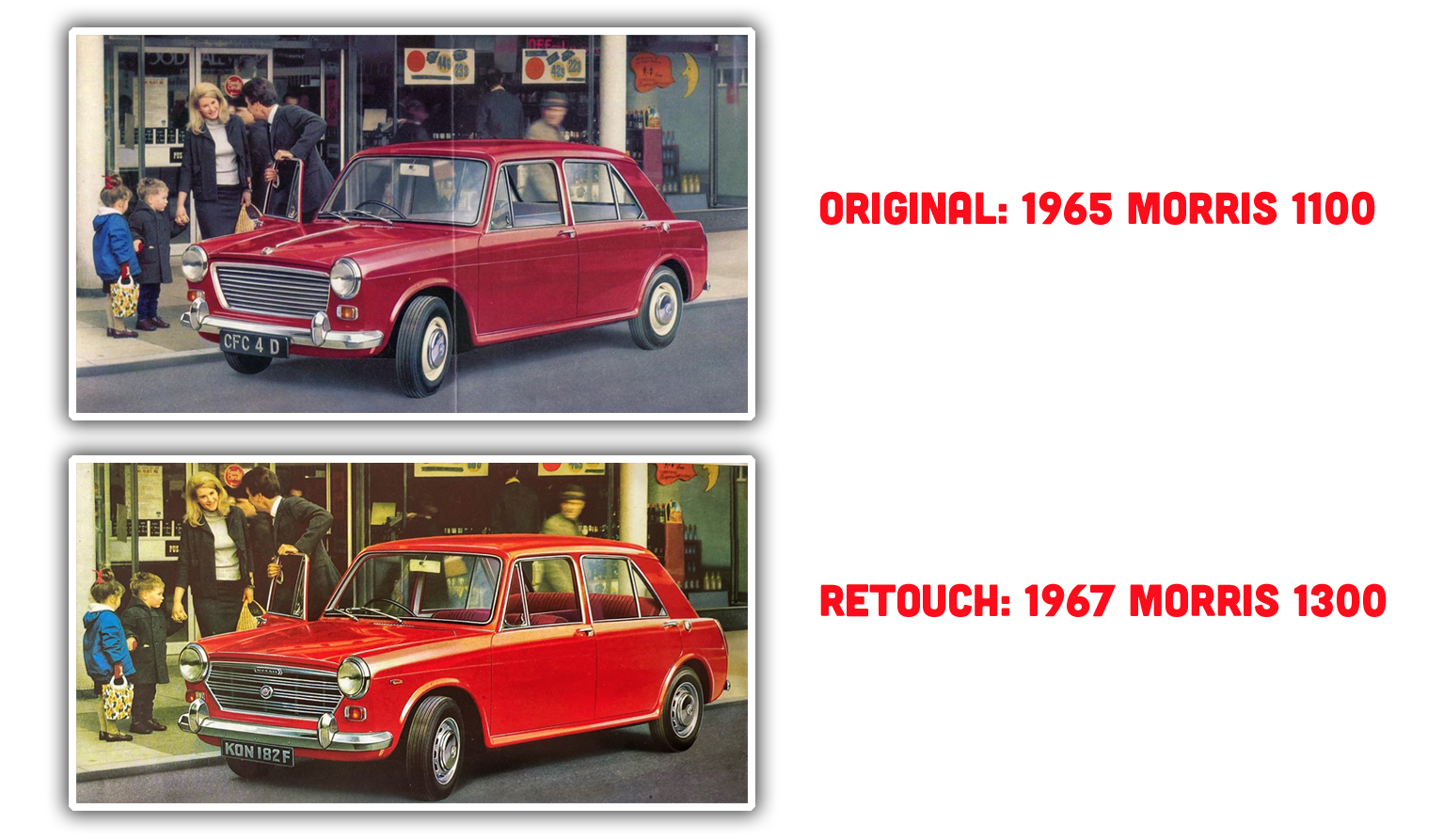
BMC was a master – or maybe abuser – of brand engineering, so the basic car you see here, was sold as an Austin, MG, Morris, Riley, Vanden Plas, and Wolseley. This clever transverse-engine, FWD machine was like a grown-up Mini and was Britian’s best selling car for much of the 1960s.
And yet despite all that success, BMC still cheaped out by re-using a two-year-old photo of the Morris 1100 for the updated Morris 1300.
Whoever retouched the photo did a fantastic job at it, extensively re-working the grille, wheels, license plate, adding marker lamps, and other little details. It seems ridiculous that all this work was considered easier than just doing a new photo shoot, but Andrew offered another likely possibility: BMC may not have had any new cars ready to actually shoot.
Brochures were like the company’s website is today, but, being physically printed and distributed, took longer to be made available. So, if BMC wanted brochures ready when the cars were debuted, they weren’t always able to have cars to photograph early enough to get brochures printed, hence the skillful madness you see there.
Here’s another fun example:
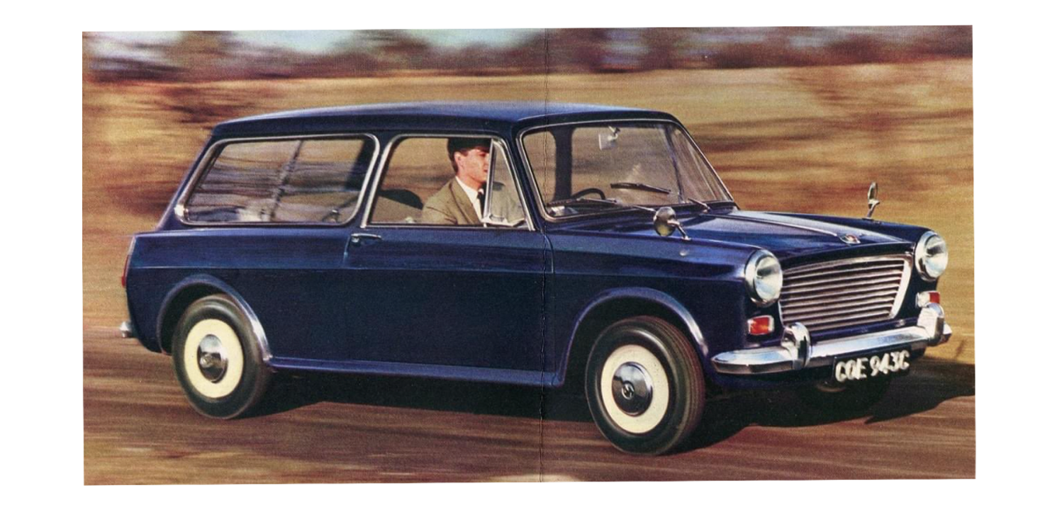
Again, 1965 BMC 1100. And now, the new model, two years and 200cc later:

Okay, sure, the smudged-out license plate is kind of lazy, but look at those new wheels, kicky new side stripe, and again marker lamps, new grille, hood, badging, and more.
The BMC 1800 got similar extensive re-touchings as it went from Mk I to Mk II:
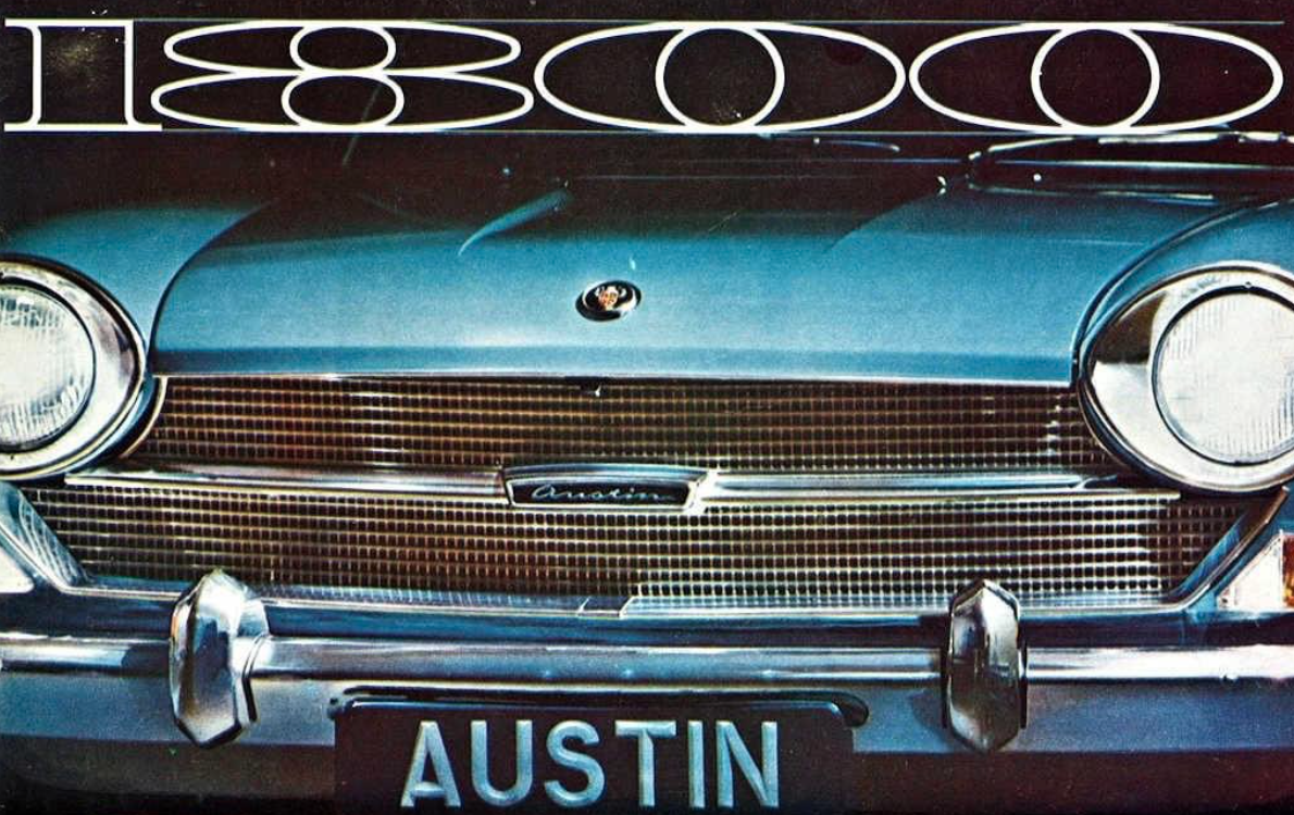
Here we see the Mk I, with its fine mesh grille. And next:
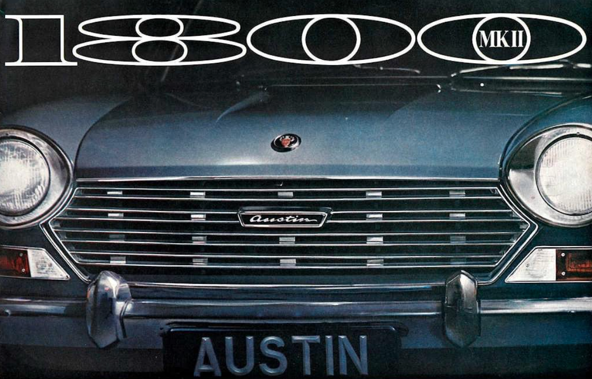
There’s so much I don’t understand about what’s going on here. I’m assured this is a re-touch of the first photo, and it very much seems to be (check out the matching reflection patterns in the headlamp bezels), but the extent of the re-touching is significant. The whole grille! The turn indicators!
Were these elements just drawn in, or were there photographs taken and parts collaged together? If that was the case, why wasn’t a new photo just taken? Perhaps to preserve the overall layout and design?
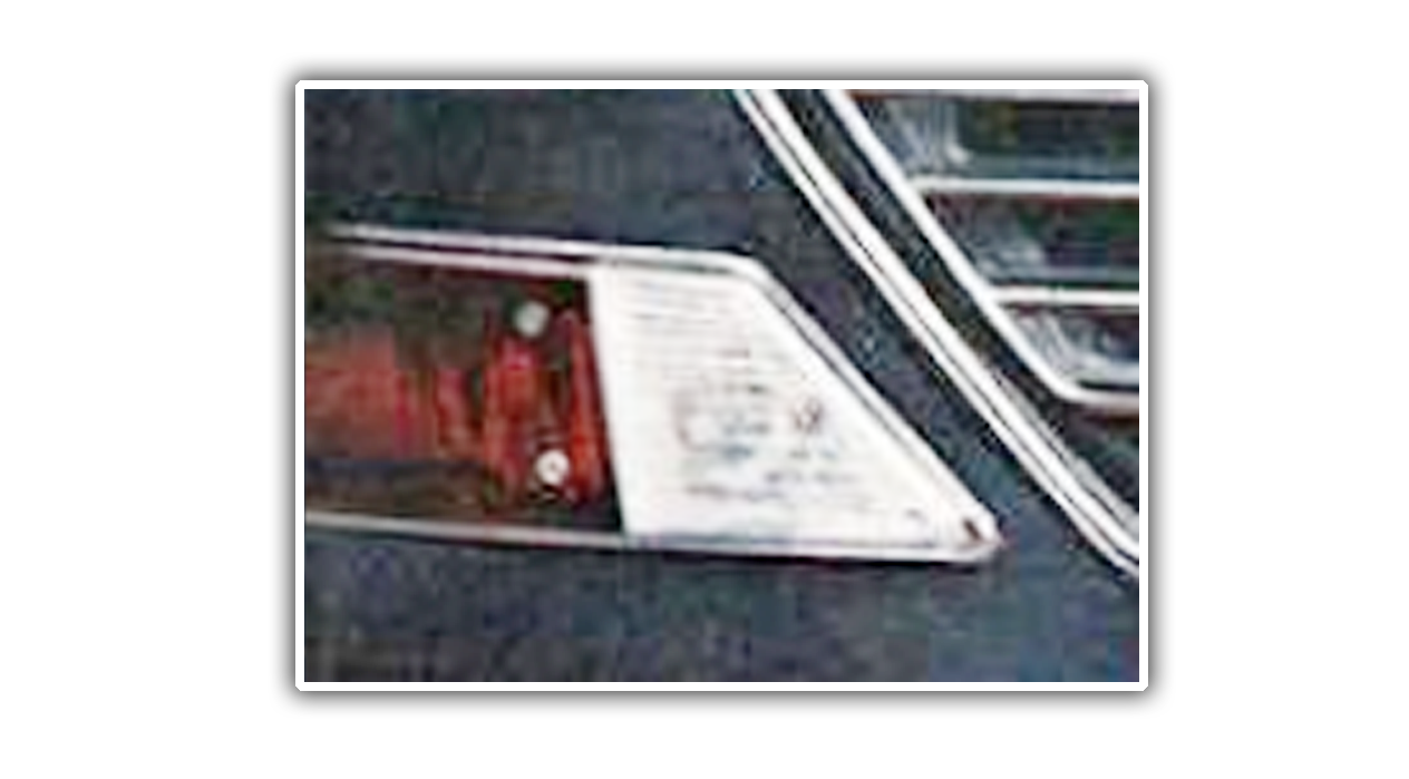
Maybe I can sense some evidence of hand-painting on the indicator/sidelamp light here, but holy crap, is this skillful.
We get a similarly extensive re-working on these brochures for the Mk I and Mk II Morris Monaco re-badged version:
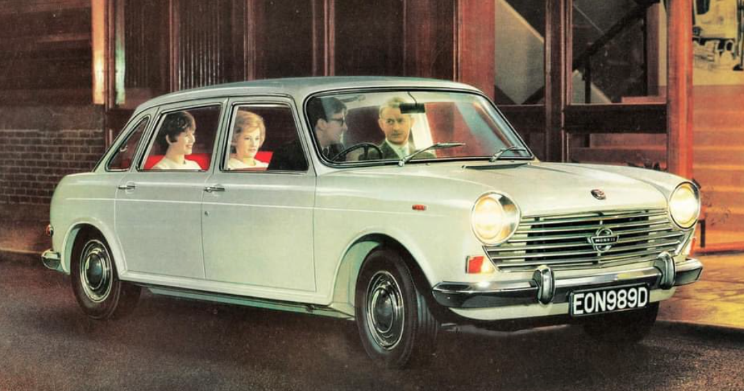
That’s the Mk I, with the strangely glowing people inside, and here’s the facelifted Mk II:
 Again, extensive front end changes, some subtle rear end changes, and just to be sure everyone is fooled, the number plate now ends with an “F” instead of a “D.” The perfect crime.
Interior shots got the same treatment:
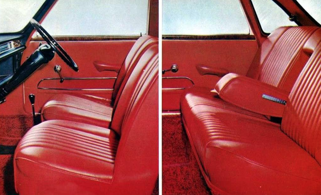
That’s Mk I, and here’s MK II:
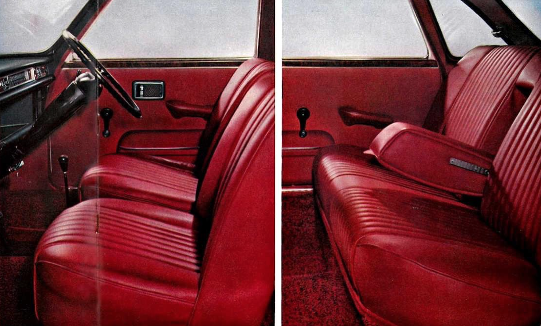
It’s very subtle: new armrests, window cranks, interior door handles, different door pockets. Little details. Bigger is this, though:
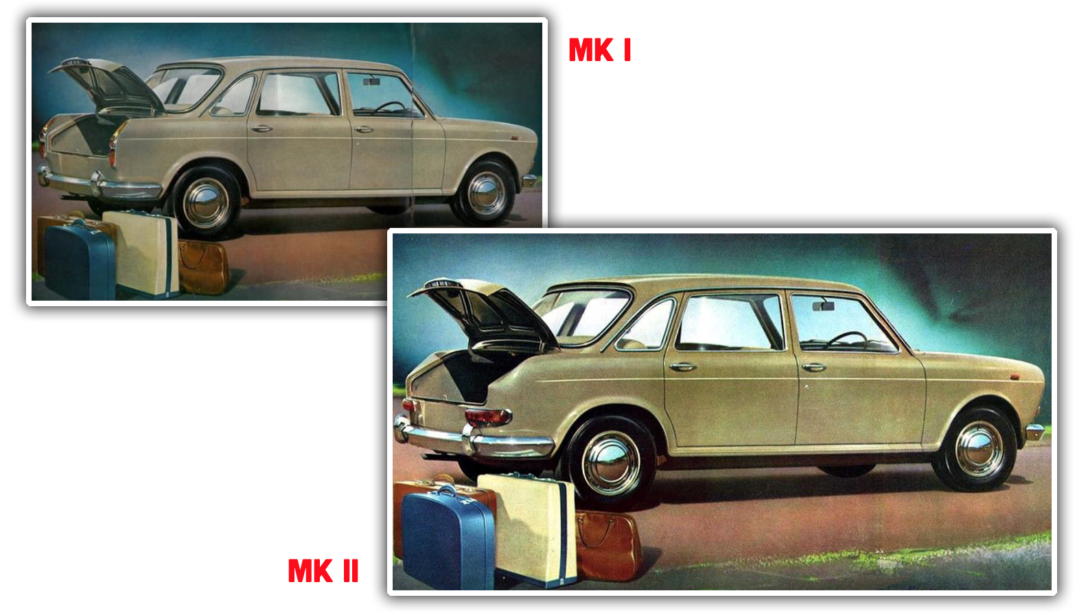
The whole rear end and taillight treatment changed and it still wasn’t enough to warrant a new photo.
I’m still unclear as to why BMC took this approach, so I reached out to Andrew, who had some interesting insights:
That’s a great question & was pondering that myself. I think you could say it was easier for them to do an artistic version if the actual car wasn’t available (which could be the case for the Mk2 1100 given the last-minute nature of its development.
It also allowed them to simply reuse old brochures images which might’ve saved on marketing costs.
The fact is BMC was a firm that defied logic at times.A group of shop stewards visited British PM Harold Wilson at a party conference to complain about BMC redundancies. I think 7 were supposed to meet him & 12 turned up which led to him quipping that this was typical of the firm needing 12 people to do the job of 7.


I’m fairly certain the genius in BMC’s marketing wing went on to Hindusthan Motors in ex-colony India after BMC went belly up. The HM Ambassador had 4 different models (Marks 1 – IV), where they only ever changed the grille and courtesy lamps between their sequential laumches. Oh, and the hood ornament. Same wheezy engine? Check. Same outdated interiors? Check. Same tail lights? Check. BMC at work? Life imitating Art?
I could actually be on to something here. The leaps of engineering between Mark II to IV were in the mid-70’s to mid-80’s – perfect timing for the career move I suspect. And…HM used BMC engines, too.
Aa great read. However, the BMC 1800 MkI and MKII are mixed up. The one with the horisontal taillamps is MkI, not MkII. Taillamps, Jason!
I worked in a photo studio that did Rock ‘n’ roll album cover Photography back in the late 70s, and we did this sort of thing all the time. For example there was a band where the woman who was the main singer insisted on wearing this purple leather three piece suit in the photograph that was taken in a automobile wrecking yard at night. I think we had found a place that would stack up a bunch of wrecked Cadillacs and a couple of Rolls Royces in an artistic pile. The idea was that the band had wrecked the cars, and the shoot was at night to avoid getting the general New Jersey hellscape in the background. Also of course Rock ‘n’ roll equals night?
The film comes back from the lab and it looks great except the lead singer basically just disappears. If you didn’t look carefully it looks like she was peeking out of one of the car wrecks in the background because it’s just her face and a bunch of shiny purple that looks pretty much like the shiny wrecked limo behind her.
Anyway, what finally happened was it the Art Director knew a guy who knew a guy ( knowing a guy was and still is an billable thing ) who could have a die transfer made and then hand paint the dyes onto the matrices so that the formerly purple leather three-piece suit was now a banana yellow leather three-piece suit, and the shot looked great. They even put some reflections of yellow into the wrecked Cadillacs in the background. I think they spent three times the actual cost of shooting the photograph on the retouching because the band wasn’t available for a reshoot and probably all of the wrecked Cadillacs had been shredded and sent to the steel mill.
Apparently the band sucked, never ever saw the photograph actually used other than hanging over desks in the art department at the record company.
Is that Vladimir Putin in the passenger seat of the Morris Monaco?
Probably in the early stages of invading Ukraine.
The Audi version of this was using mirror images of the German market photos for the right hand drive U.K. brochures in the 70s. Badges and number plates would be touched up correctly but, for example, instrument panels had incomprehensible lettering and needles pointing in the wrong direction. Audi were too lazy to change the windscreen wipers over for right hand drive in the actual cars – but in the brochure – no blind spots at all!
So, being a graphic designer who started his career at the tail end of hand paste up, this doesn’t surprise me at all. But I think you have to look at this is the context of institutional momentum, rather than what makes the most sense. Here are several reasons why I think this extensive retouching was dome:
1 – It’s always been done this way. Do not discount this approach. Once something is done successfully, it often becomes S.O.P.
2 – It’s easier to do this in-house than to hire a free-lance photographer. It’s also easier than convincing your penny pinching boss to pay a photographer for an entire shoot. BTW photographers often have a full day minimum regardless how many, or few, shots they take.
4 – You can control the timeline of the final product, rather than relying on an outside contractor (photographer). You can also reshuffle assets as needed more easily, i.e, rearrange the project order when the big boss decides he wants a certain thing done NOW for no particular reason.
3 – You have more control over the final product. Half-way through and the side trim unexpectedly gets changed? Not as big of a problem since you’re already reworking the photo anyway.
4 – It’s less hassle with other departments. Hiring an outside contractor requires dealing with your purchasing department, possibly HR, and who knows what else? I know I have done things in-house before that would have been better served by out-sourcing, simply so I could avoid dealing with other departments and their nonsensical “rules.”
5 – Finally the biggie, job security. You really don’t want the boss to decide that out-sourcing your work is better than paying your salary. I’ve been there before, and guess what, it wasn’t even close to being cheaper.
I never quite realized the level of “can’t be bothered” Chrysler Canada had achieved, but I strongly remembered them using the exact same picture for the cover of the ’81 Diplomat and Caravelle (seeing them both in the same bin at an antiques market once). Turns out, it’s the exact same brochure with the 80’s equivalent of Find and Replace.
Bear with me because it seems too many links runs afoul of the moderation algorithm, but oldcarbrochures has the one for the Diplomat as well, and it’s identical (pretty much like the cars themselves).
http://oldcarbrochures.org/Canada/Chrysler-Canada/Plymouth/1981-Plymouth-Caravelle-Brochure/index.html
A decade ago the manufacturer I work for was preparing to launch a special edition with new colours and options. Standard model year update stuff. We’d completed the prototype builds and we’re all good to go, until we’d find out the sales department had photoshopped the brochures instead of photographing the prototypes, and had coloured one of the components incorrectly.
As the brochures were printed, but we had no parts on stock and no cars built for customers, it was cheaper to change the car to match the brochure than it was to reprint correct brochures. Cue a lot of running about by suppliers to correct their process and give us new parts before launch so the car matches the adverts.
So, if you ever see a picture of a [YEAR] [MODEL] with [COLOUR 1] [PARTS] instead of [COLOUR 2], it’s one of the prototypes built before the brochures were printed.
Nissan totally still does it today. Check the Titans on the left and the right on the 2nd page of these factory brochures from 2017-2019. Same truck, different trim. I frequently have to look at factory brochures for research and noticed this.
https://www.auto-brochures.com/makes/Nissan/Titan/Nissan_US%20Titan_2017.pdf
https://www.auto-brochures.com/makes/Nissan/Titan/Nissan_US%20Titan_2018.pdf
https://www.auto-brochures.com/makes/Nissan/Titan/Nissan_US%20Titan_2019-2.pdf
40-ish years ago, when I did an internship at a toy design consultancy, it was pointed out to me that many of the package photos on newly released toys were actually photos of painted prototypes, because the production pieces weren’t ready in time for the photoshoot. Once you knew, it was pretty obvious and led to 50% of any visit to Toys’R’Us being taken up by close perusal of the boxes.
Similar to TV commercials for cars nowadays using CG from the 3D CAD.
I’m pretty sure that the strangely glowing people in the last one aren’t actually in that car. The lighting doesn’t match the ambient lighting nor does it match between front and back seat passengers (and I doubt they were using lights inside the car), I can’t tell what the driver is supposed to be doing, the headlining over the front passenger looks drawn in,, and he looks like a hand colored black and white piece of clip art.
I can’t tell if this is a very pasted together image, or they did a great job of making a photograph look faked. Impressive either way.
I’m going to take a wild ass guess: maybe it has something to do with unions? Like, the photographer’s union was on strike, so the marketing department called on the photo retouchers, who were in a different union, to just edit what was on file.
Or, maybe it’s just some weird British thing, like how outdoor scenes in their TV shows are shot on film, while indoor scenes are shot on video. Some law where car marketing materials have to use the same photos if the model hasn’t changed much, BMC couldn’t get a waiver from the Ministry of Motoring, and the lawyers said a retouched photo is technically the same photo?
I dunno. I got nothing.
I think the indoor-TV/outdoor-film thing is because early TV cameras were huge, heavy, and power hungry, and had to be hooked up to an equally huge (double wardrobe-sized) wire recorder. Where as film cameras of the same era could be carried by one person, and the resulting roll of film could be held in one hand.
For a location shoot you need a camera and recording device that can at least fit in a van, while still providing similar quality to the studio cameras.
Considering the times, the late ‘60’s, the lack of British birds in mini skirts is unforgivable…
They were all booked for Norton and Triumph ads.
“Photo retouching was always a skilled profession and had to take some time and money, but I suppose that could still be less than a photographer and securing a location…”
Most likely not. In purest BMC fashion, it is extremely plausible that at the end of the day they managed to spend more money on an artist than on a photographer and a model, despite initial calculations.
And it took 6 all-day multidepartment meetings, an outside consulting firm, and a phone book length report to decide on the retouching, then the same process afterward to analyze how much has been saved
Great stuff!
Also do one on the incredible small people used in old car ads:
http://www.vw-model.dk/Gl.%20reklamer/reklame%20billeder/billeder/VW%201939%20Der%20KDF%20Wagen%20side%201.jpg
[ ] shocked
[x] not shocked
It the first two examples are to be believed, then 1967 was a much yellower year than 1965.
It was – but it was a mellow yellow
All the later pics have a slight color cast. It can be amazing how many inconsistencies you can hide in a photo simply by tinting it. Not that I’ve ever used that technique, of course…
It’s possible that the colour cast is a result of different people photographing different brochures which might have faded, or the photos might have been taken in different light etc..
If you laid both brochures out next to each other at the time, they probably looked more similar.
The Autopian version of 6 differences game.
I never quite realized the level of “3…2…1…AAAND fuckit!” Chrysler Canada had achieved, but I strongly remembered them using the exact same picture for the cover of the ’81 Diplomat and Caravelle (seeing them both in the same bin at an antiques market once). Turns out, it’s the exact same brochure with the 80’s equivalent of Find and Replace.
http://oldcarbrochures.org/Canada/Chrysler-Canada/Plymouth/1981-Plymouth-Caravelle-Brochure/index.html
http://oldcarbrochures.org/Canada/Chrysler-Canada/Dodge/1981-Dodge-Diplomat-Brochure/index.html
I highly recommend British Leyland: Chronicle of a Car Crash 1968–1978 by Chris Cowin for an in-depth look at the cars and key figures behind this decade-long disaster. Fascinating book.
If you liked that, try Betting On A Miracle, which covers the years 1978-1986.
Just as well. They were able to use all that marketing money they saved to sort out the electrics…
This is the predecessor to today’s vaporware website full of moderately skillful renders showing impossible things. Except instead it’s way more mundane and about 10,000x more skillfully. Whoever did these was a genius. Whoever ordered them to be done was a hack.
The number plate change from “D” to “F” was crucial, as the last letter indicated the year the car was first registered. Gotta update the plate to match the year!
And they did it to the Morris 1300 too, as well as blurring it (C to F).