One of the things I like best about really early video games is how much heavy lifting the illustrated cabinet or box art did when it came to conveying the tone and mood of the game itself, which often conveyed things like a car with something made on a grid of 8×8 fat pixels. The side art helped your imagination fill in the considerable gaps, and, generally, it worked. One early game, 1982’s Bump n’ Jump from Data East, I especially find fascinating because there were so many versions of the cabinet side art, marquee, box art, flyer art, and more, and they all seemed to show different kinds of cars. Nobody could make up their mind about what the cars in the actual game were supposed to be, so they just threw everything at it, and, incredibly, nothing that was shown even really came close to looking like the pixellated cars on the screen. Let’s look at some of the cars in the art, because there are some really bizarre choices.
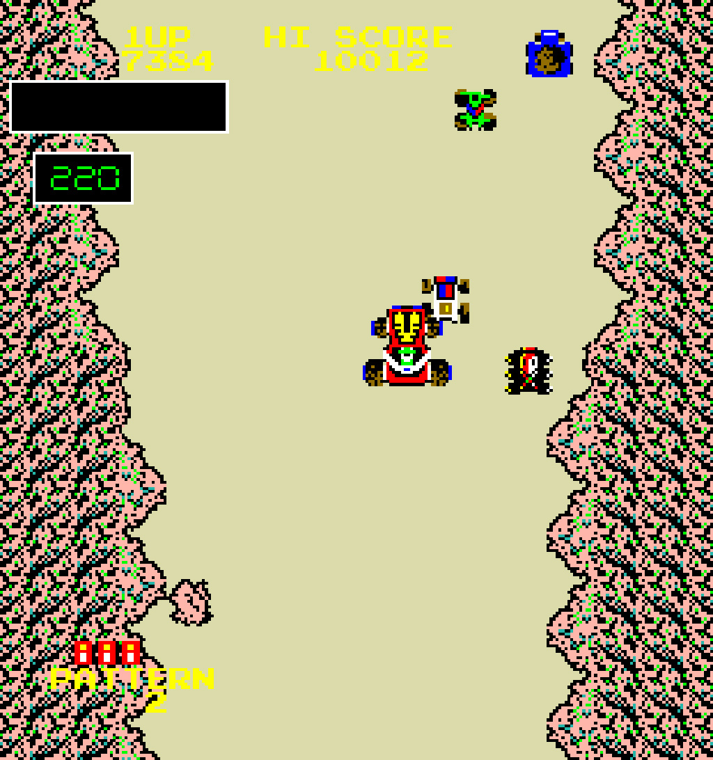
First, here’s a screenshot of the game, the arcade version, so you can see the source material all the art is supposed to represent:

Those are pretty typical early ’80s video game graphics; something like 16 colors, screen resolution of around 200×240, and those cars seem to be open-wheel race cars of some kind, with hood graphics and roll bars.
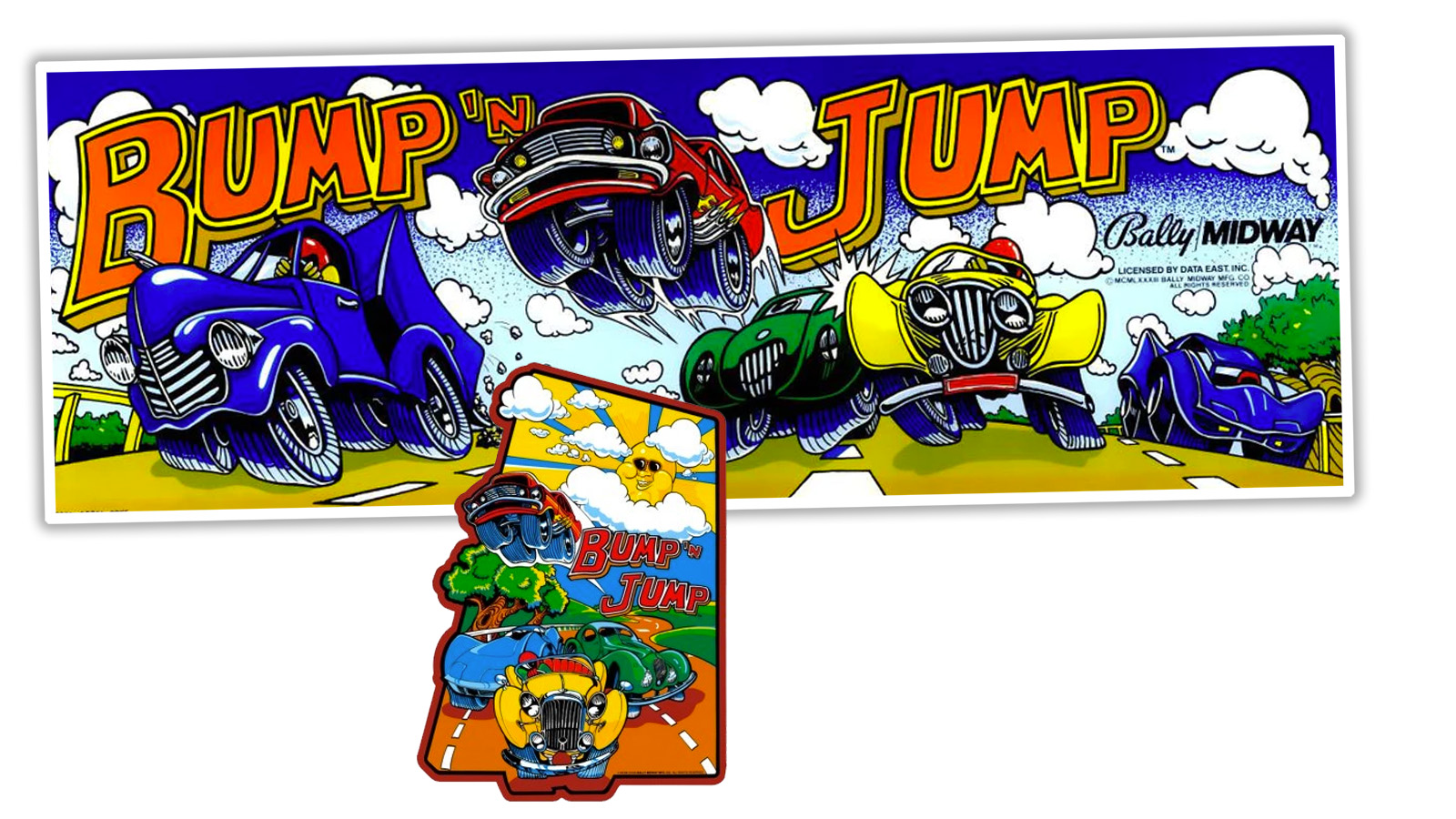
Look up top there, at the main marquee and side art. Actually, let me show it again, to save you scrolling:
 First, those cars look nothing like those in the game, and once we start looking at what those cars actually are, it gets so much weirder. The marquee has what looks like a ’50s-era pickup, a late-’60s Mustang flying above, something odd, streamlined and green, a yellow ’30s-era looking thing, and what seems to be a C3 Corvette.
If we look at the side art there, we get some more details, with our flying Mustang, C3 ‘Vette, and yellow car prominent, but the green car gets more detail and is revealed to be… a Bugatti Type 57SC Atlantic? What the hell? That’s not a usual choice for a game about smashing your car into other cars and leaping over bodies of water, at least I didn’t think it was.
Let’s see what they did for the advertising flyers for the game:

Well, damn, now we have a whole new set of cars added. The yellow whateverthatis and the C3 ‘Vette and the airborne Mustang return on the front, but the rear adds a cute-ified… is that a Ferrari 308? Wait, no, duh, a Lamborghini Countach. And, of course, a Porsche 911. The artistically-enhanced screenshot there clearly shows open-wheel cars, and something that could be a Mustang?
How about the box art for the home versions? What do they show?

Man, did nobody talk to anyone else when they were designing these versions? The Intellivision (and the same art was used for the Atari 2600 port) has a quite recognizable 1980-ish Pontiac Trans Am, and then the rest of the cars are all oddly genericized blocky things. The Coleco version has what may be the most in-game accurate cars, open wheel buggy things with big roll cages, and the Nintendo version features a green Manx-ish dune buggy, a bit more angular and featuring what looks like a radiator behind the un-vented nose there.
Also, either that dune buggy is tiny or those people are huge. And watch your foot, lady.
I think the weirdest version has to be this one, for the Deco Cassette System, which was like an arcade cabinet that could change games with cartridges. The whole tone is different here: 
Is that dude wearing like a caveman-leopard-skin top? Are they on a volcano now? He’s in some kind of rugged dune buggy/ATV thing, but look what else is racing: a six-wheeled Gremlin-looking thing, a dump truck, a freaking forklift, some blue sports car, and, I think most bonkersishly, a flapjacking Messerschmitt Kabineroller which I enlarged up there because, holy shit.
I have to hand it to these artists; why be accurate when you can have some real fun? I grew up around these machines and had no idea until now there was a freaking Messerschmitt hiding on one! Damn. What a world.

https://robbreport.com/wp-content/uploads/2016/08/01-1937-talbot-lago-t150cs1.jpg
The green car is a 1937 Talbot-Lago T150-C SS Coupé aérodynamique ‘Goutte d’Eau’, Figoni & Falaschi according to the snooty website that publishes the whole name instead of just “TALBOT LAGO”
You were close though!
“Is that dude wearing like a caveman-leopard-skin top?”
He’s just a gigolo.
I’d add the “Supercharger” games for Atari 2600. Awesome box art…sketchy graphics
This era’s lack of connection between cover art and the actual game is legendary, and quite cool.
Atari 2600 games had perhaps the best, most wonderfully jarring disconnects. The art on the boxes was so wonderfully analog, compared to the blocky pixels of the actual gameplay. I always remember Missile Command’s depiction of a futuristic WarGames-style situation. Turn your key!!
Best arcade game for this had to be Tempest. The cabinet for this diabolically difficult abstract shooter had all kind of…monsters?!
I have a coffee table book that was put out in 2016, Art of Atari. Not only is it a good look at the art, but also the process and how some of the disconnects happened within the one company. I highly recommend it.
Thank you for this – to Amazon!
Now that Atari is reinventing itself into something, I really liked how its concept sketches of its planned hotels (?!) looked totally like the old cartridge/box cover art.
The current Atari is just a company that has bought the name and trademarks, it’s nothing to do with the original company.
I looooved Tempest, and would love to own one. That and Centipede.
Does that six-wheeled ‘Gremlin’ – actually the shape of the door opening reminds me of a Bond Bug – have two engines, front and rear?
Personally I think the six-wheeler is a gen 1 Civic
It was the 80’s… and the cocaine was flowing freely at the ad agencies that took up the artwork contracts. I’m pretty sure you can deduce how many lines were done by rating the bizzarro-level of the artwork.
The back of the flyer clearly shows a Lamborghini Countach next to the 911.
Because how could there be anything car-related in the 1980s without one?
Beat me to it. It’s the crazy wheel arches.
I really want someone to release a new Bump ‘n’ Jump based entirely on the art, now. Racing forklifts and dump trucks down a mountain, hopping muscle cars over box trucks, all of it.
You are very generous in this description. Buying videogames in this era was TOUGH. Not only were the box art images ridiculous as described, but you had to ascertain whether a company was using actual screenshots or this crap. And you couldn’t just look up reviews online, either. You’d have to buy a whole magazine just to see any semi-honest assessment, and that was if you were lucky enough to find a magazine with a review of the game.
[oldmanyellsatcloud.jpg]
But I still have fond memories of the Intellivision controllers and the game-specific inserts for their number pads.
Coleco had game-specific inserts for their controllers as well. I know Mouse Trap had them. I was more of an Up’N Down person on the C64. A few years later, there was a decent version of Outrun for the Sega Master System.
Yeah, I never had the ColecoVision or any friends/relatives with one, so my experience is very limited, but it also seems like the inserts were a little better designed. The tab probably made it easier to work with them.
Outrun was pretty good, both arcade and home versions. I remember being very impressed with it at the time. Looking at it now, I still think it holds up. I may need to find a way to play it again.