“So I’ve found this car, a special car,” your classic car dealer tells you. “Something unique, a classic Alfa Romeo, built by a prestigious Italian coachbuilder. One-of-one, you’ve got to see it,” he says. You’re expecting glorious lines, exquisite craftsmanship, and the unquestionable taste only an Italian could deliver, right? Well, you ain’t seen nothing yet.
The car in question is the Alfa Romeo Castagna Vittoria, built in 1994 as a one-off concept to be displayed at the Geneva Motor Show the following year. It was intended to herald in the revival of Carrozzeria Castagna, a famous Milanese coachbuilder that was first founded in 1849 before ceasing operations in 1954.
The mid-90s comeback was thanks to businessmen Uberto Petra and automotive designer Gioacchino Acampora. The latter penned a daring design that would put the company back in the spotlight, based upon an Alfa Romeo 75 from 1987. Buying a 7-year-old car as a base was probably a good way to save a few bucks as the company found its feet.

Where the 75 was a boxy, angular sedan straight out of the 1980s, Acampora envisaged something altogether sleeker and more rounded. In theory, it was something more befitting the 1990s, and a drastic departure that would highlight the coachbuilder’s unique offering to the marketplace. Plus, it rocked Alfa Romeo’s gorgeous 3.0-liter Busso V6 under the hood—one of the sweetest sounding engines ever born on the continent.
The result is a strange, gloopy concept car with proportions most toddlers could beat when they first pick up a box of Lego. The front clamshell bonnet has a long overhang, culminating in a triangular tooth that notches down into a negative-V element in the front splitter. This eye-searing feature is flanked by a pair of entirely pedestrian rectangular headlights that in no way fit the car.


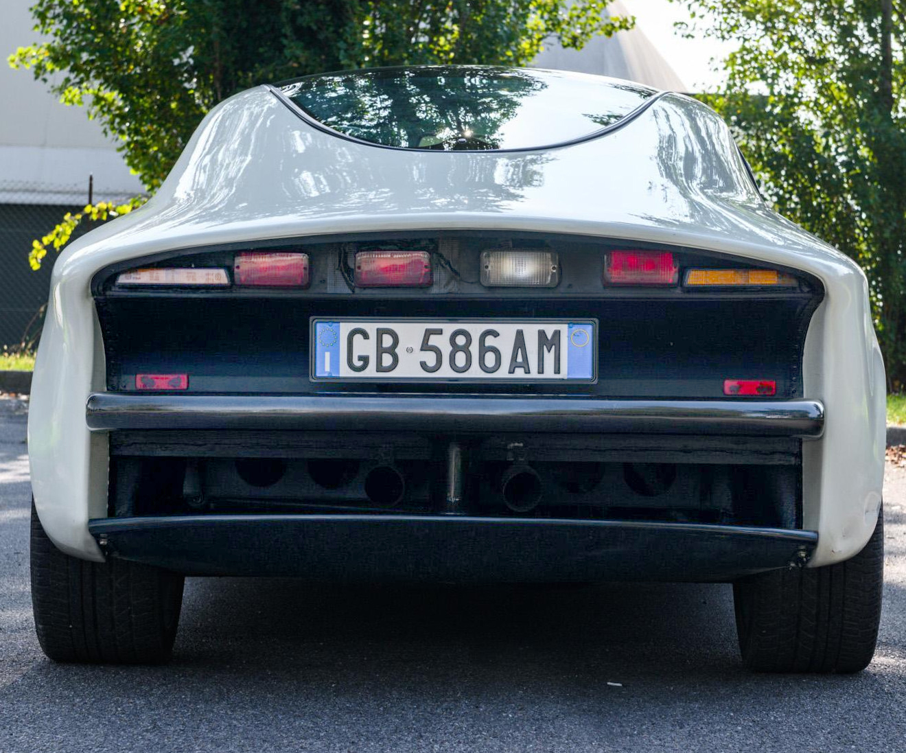
[Editor’s Note: Hold on, we gotta talk about this shockingly phoned-in taillight setup here. I mean, look at that crap! Buying cheap lights from the catalog is one thing, but not even going past the first page is something else. What are those indicators, side marker lamps from something? And are those just the cheapest rectangular DIY-trailer taillights they could get? Is one of them held on with black gaffer tape? The hell is this crap? This is like University project experimental lead-acid 1970s EV-grade taillights here. Embarassing. – JT]

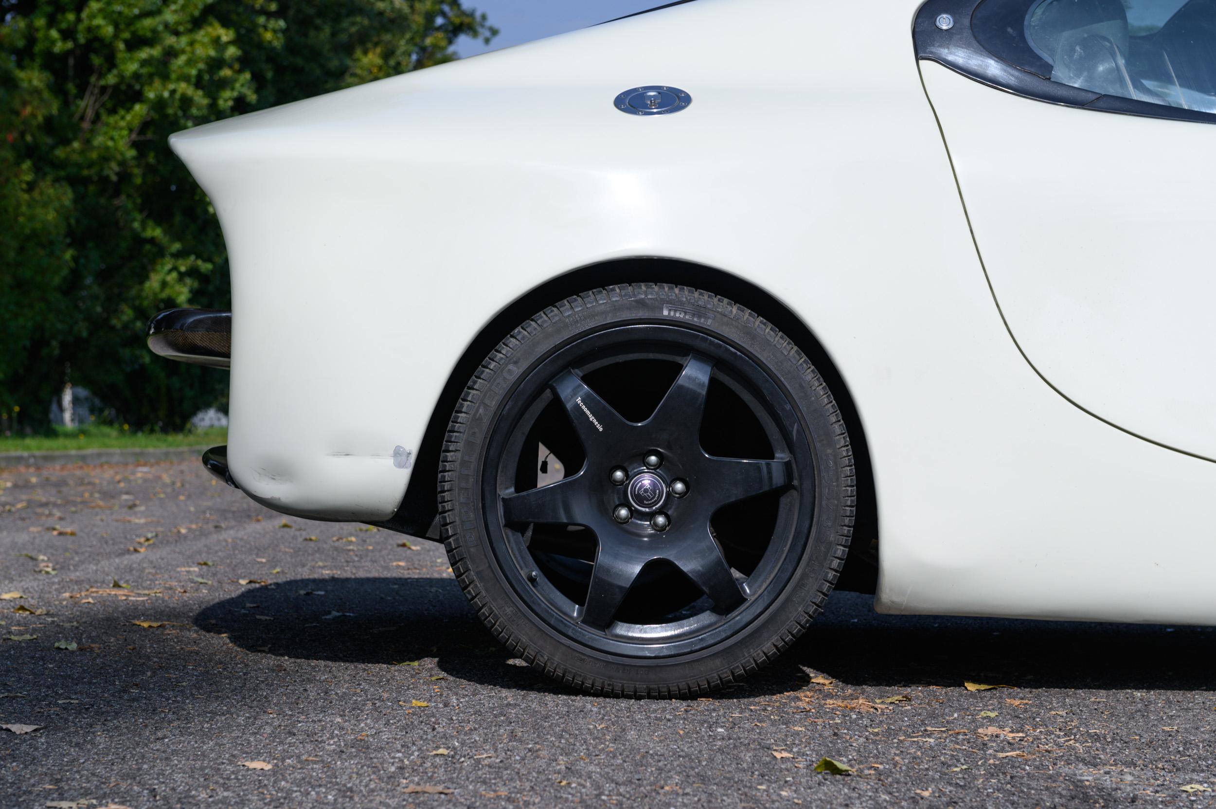
Heading further rearward, the car wears a sleek bubble canopy that could actually be quite fetching if anything else around it matched. Meanwhile, the door shutline on the coupe awkwardly rises sooner than it probably needs to as well. The roofline then tangents towards the rear in a straight line to something akin to a hollowed-out Kammback tail. Overall, panel fit looks a little sloppy, too. Given the panels were hand-built, it may have been that the upstart coachbuilder was in a touch of a rush ahead of their big return to the spotlight.
Viewed from the side, the car almost works if you hide the front end. With it visible, though, it’s clear the front splitter sits way too high and throws off the whole profile. Between that and the goofy face created by the headlights and the Megatooth, and it’s a show car that stands out for all the wrong reasons.

It bears noting, though, that this car didn’t actually spell doom for the company. The coachbuilder continues on today, recently building everything from a drop-top Fiat 500 to a Peugeot 308 GT. Some of their modern designs are actually super fresh and inspired. It suggests that they’ve either got their eye in since the early 90s, or they simply ran out of time on this one.

Inside, it’s a striking thing, too, and not in such a bad way, either. Charcoal carpets and dash are paired with a green flocked instrument binnacle and center console. The old-school setup with all-analog gauges actaully works in this way, with the flocked material adding an appealing rally-ready vibe. The rich green leather of the seats is appealing too. The real key is that Acampora didn’t make the mistake of specifying green carpets as well, which would have turned the tasteful use of color into something overwhelming.
The car has just 2,500 kilometers (1553 miles) on the odometer. The interior does show signs of being used, but overall, it looks to be in good shape. We’re told the engine was dyno tested on the bench at 254 horsepower, too, suggesting its fit and in fighting form. It also rocks some upgrades including front and rear suspension cribbed from the Alfa Romeo SZ ES30.

Currently living in Italy, the car will be available for a physical viewing between November 17 and 19 at the Milano Autoclassica. At the time of writing, three bids have already been made, with the vehicle initially listed with a guide price between £125,000 and £135,000 ($153,000 and $165,000 USD). Whether you can stomach that face at that kind of price tag is up to you.


That rear end makes me think VW saw that concept and thought “we could do better with the XL1!”
That front end though: Betcha the mother loves it.
what the fuck did i just have the unfortunate circumstance of witnessing, and why can’t i look away?
Is the car full of cocaine? Or perhaps the bidders are? Those are about the only two options I can come up with to justify that price.
I think they’ve since hidden the guide price, too.
It’s a coachbuilder with little provenance so I’m not sure why they think it would command that much.
Leonardo DiCaprio’s sweater? Sure, I can see that selling for five figures. But you wouldn’t get the same for Kevin James’s socks.
Here’s something that you never gonna forget.
Is Uberto Petra Italian for Will.I.Am?
Domagoj Dukec is frothing.
Fairly warm take here, so gird up: I now have a coachbuilder to rank below Zagato. Some of the Fiat 500 convertibles are ok, but the rest of the work is definitely not to my taste.
The hot take part is obviously my lack of enthusiasm for most Zagato designs. I freely acknowledge there are at least a few awesome Zagatos, but those exceptions won’t change my general opinion.
Zagato’s hits are the exceptions and generally long in the past.
Zagato is like, yeah, okay, weird, but at least the panels line up
Image it without the front overhang and it almost works, almost, that huge slab side isn’t going to work ever.
I wonder if as a show car it had no tail lights and different headlights?
And to make it road legal someone hot glued in something
https://www.youtube.com/watch?v=dRhR8sXrqcI
We have GR Supra at home…
KILL IT WITH FIRE
Man, that’s rough…
I can’t get past the tail lights. Why would you have four evenly spaced lights centered on the back of the vehicle and make one of them clear? Why not use three slightly larger lights? Or maybe four slightly smaller red lights with the clear light in the middle? Maybe use two clear lights and two red lights? Do something to make it symmetrical.
Also, what is the deal with the interior? The green fabric on the dashboard, console, and doors looks like artificial grass used on a putting green.
Or have both middle lights with clear covers, but with a red bulb in the foglight(?)
That would work as well. There are numerous symmetrical light configurations they could have used that would have looked a lot better than what they came up with. I presume I am not the only one who is bothered by the asymmetry.
I wonder if these lights are temporary or were added after the car was displayed to allow it to be registered and driven. That would explain why the tail lights look like an afterthought or taped on.
Yeah. They look like trailer lights from Autozone.
I think the rear facia has a single backup light and rear fog light flanked by symmetrical brake lights. Still unattractive.
Why does one of the taillights have tape holding it in!
There’s so much good too… That’s what makes it extra heartbreaking.
I… don’t hate it? I mean, it looks rushed and unfinished, but if you squint really hard you can kinda-sorta see where they wanted to go with it, but didn’t quite get there. Like with a little more time, and maybe without the boss interrupting all the freaking time, it could have turned out better, but they had to just get it out the door as-is.
I also don’t hate it. It looks rushed, but to me the bigger problem is that it looks like two different cars grafted together at the A pillar. The front end styling looks angular and the back end styling looks rounded. The two styling themes look decent individually but look awkward together.
Yeah, absolutely my feeling. They needed another 3-6 months.
Yeah, that might have been enough time to find a designer was wasn’t blind.
Seriously, this really does remind me of the drawing of an elephant as described by five blind men.
Compared to this, the SZ might as well be Cindy Crawford
Counterpoint: the SZ is strangely wonderful
You are correct.
Looks like something I would have drawn as a child, and then thrown out because it looked weird and the teacher noticed I wasn’t paying attention in class.
Even the glass roof has a “oh crap I screwed up the roofline, I’ll just add another line to make it look better” vibe.
Am I the only one that sees MkV Supra in the front 3/4 view?
Blacked out A pillar and wide hips, squinty headlights with a tall narrow negative space under the middle of the nose, black front splitter across the bottom where most cars have a section of body color .
The proportions are off, but a lot of this is very forward thinking design limited by the era it was built. Give it some larger wheels and more form-fitting lights and it really wouldn’t look that bad.
It looks like a really close-up view of a lobster’s face.
Looks like it withered under Adrian Clarke’s disapproving glare.
Looks like a cat when they smell something like vinegar and scrunch up their nose.
It’s as if a movie director asked the props people to create the hero’s car in an sci-fi comedy set on another planet. So what I’m trying to say is I like it as a movie prop.
I actually kind of like it. The looks grow on you. Like a tumor.
Where were you a week ago when I was trying to find a scary pumpkin face?
I wasn’t expecting the front end to be that bad, but the involuntary sound of disgust I made was loud enough that my wife called to me from the other room asking if I was OK. Ugh. I wish I had never seen that.
This story definitely needed a stronger trigger warning- now I can’t un-see.
An Italian-sounding, “Well, AKSHUALLY…” on wheels. Oof.