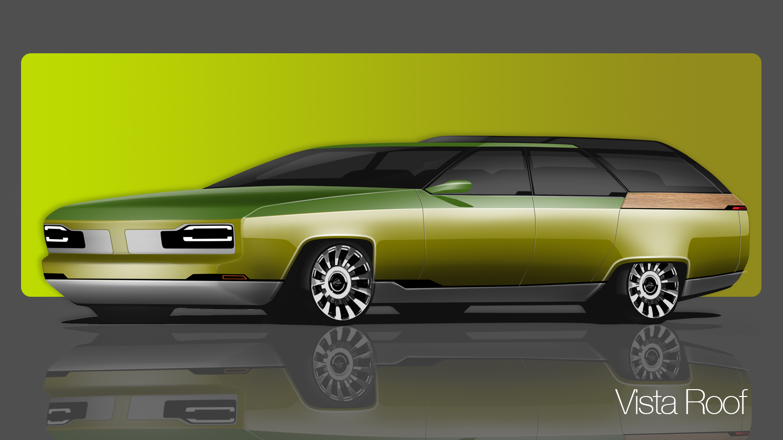
After a reader asked me to sketch a modern, electric interpretation of a classic American wagon in our last “A Car Designer Sketches Your Ideas” installment, I showed you six different designs I’d come with. You then let me know which ones you liked most, and with that input, I’ve now come up with a final mockup. Here’s a look at what I think a modern electric version of an old American wagon could look like.
Some quick notes on the latest article by the other (more secret) designer here at The Autopian: Per his stereotype, I have spent long hours at my spotless drafting table wearing my black turtleneck, and getting imaginary clay all over my Zara black suede Chelsea boots (as a non-chief designer my budget doesn’t run to Miu Miu). I always hated working with clay, as it stinks and gets everywhere, even if you’re a snooty designer (as opposed to a clay modeler) just applying tape lines to a model.
With that out of the way: We had some good discussion in the comments last week about how a modernized EV wagon should. I sketched you some options, and you chose what you liked; sketch four was by far the most popular theme despite having been probably my least favorite. I always encourage students to put their sketches up on a board for their peers to see, even if it is something they are not totally sure about. You never know what will resonate with those making the decisions.
I deliberately gave sketch four a retro front graphic, because sometimes even if you know something won’t work you draw it anyway, just to make sure. You need to establish what you don’t want to help guide which direction you do want.

In the image above, you can see I’ve tried to combine the overall theme of sketch four, with the front of sketch two, which was marginally the most popular treatment for the Down The Road Graphic (DRG).
[Editor’s note: Let’s define DRG real quick. Per Car Design News:
Designers talk about the DRG – Down-Road Graphics: the bold impression of the front of the car from 100m away. It can be the main device with which to make your brand recognisable at a glance.
-DT]
It’s bold without being aggressive, and has a distinct modern lighting treatment. American cars generally tend to favor a more assertive appearance, but by keeping it simple with bold shapes it’s not overdone or fussy.
Lots of you mentioned having a stepped or ‘vista’ style roof, so there’s more headroom for third row passengers (and more cargo volume). While a great idea in theory, glass adds weight, cost and construction complexity (which is why some cars will use a black plastic cheater panel at the base of the A pillar or on the C pillar as opposed to a small window).
[Editor’s note: Here’s an example:

-JT]
It’s important with features like this that they do actually offer a benefit to customers – there’s no point doing it as a stylistic flourish. Look at the roof of a Discovery 5 – the step is a bit half assed and really adds nothing extra in terms of practicality – it’s just a visual call back the earlier more utilitarian models. Do it properly or don’t do it all.

With that in mind I’ve imagined the vista roof as an optional extra (which is why the car directly above doesn’t have it); a long car such as our wagon is likely to have panel splits in the roof because of the size of the pressing. The rear of our car could have a horizontal split across the roof at the C pillar, and then the rear most section could be replaced with a vista roof that sits in place of the regular panel. A lot of attention would need to be paid to where the split lines go, as this would only be feasible if the rest of the rear glass was shared between both versions.

Moving to the rear view, I’ve gone for a clamshell split tailgate to maximize the size of the opening. There’s no point having a huge interior volume if you can’t get anything in the damn thing. Likewise, I’ve added a small inner tailgate (like the Renault Modus) for those times when there’s not enough room to swing the whole lower tailgate down. The wrap around wood treatment was a popular idea, but I think combined with the vista roof it’s a bit too much and starts to feel too old fashioned, so for the low roof version it’s been changed to a body -colored trim piece. It’s always important to give customers an option for things that might be a bit divisive:

Remember this is only a couple of days work – in reality designers spend weeks and months churning out sketches and many reviews take place before a couple of favored directions emerge to be worked up into preliminary digital and clay models. So is this what you imagined an EV wagon could look like? Or have I spectacularly flubbed the landing?

